UX/ UI

Gaming Spot Project: Responsive web and App design

Design made for Gaming Spot a physical store that wanted to Transition into the digital realm so it could be closer to the customers. The whole project had a duration of about 6 months and the main goal was to increase brand awareness by developing a digital product (Application) that could have a special feature and to work seamlessly with a new online store.

March 15, 2024

Research

We conducted primary and secondary research

March 15, 2024
March 25, 2024

Interviews

We interviewed and identified the needs and specifications of our goal users

March 25, 2024
April 5, 2024

Ideation of concept

We chose a path and started with the ideation process

April 5, 2024
April 15, 2024

First Lo-fi prototypes

We began with wireframing and the first lo-fi prototype

April 15, 2024
May 6, 2024

Usability study and Iteration

We conducted some usability tests, got feedback, and planned Iterations
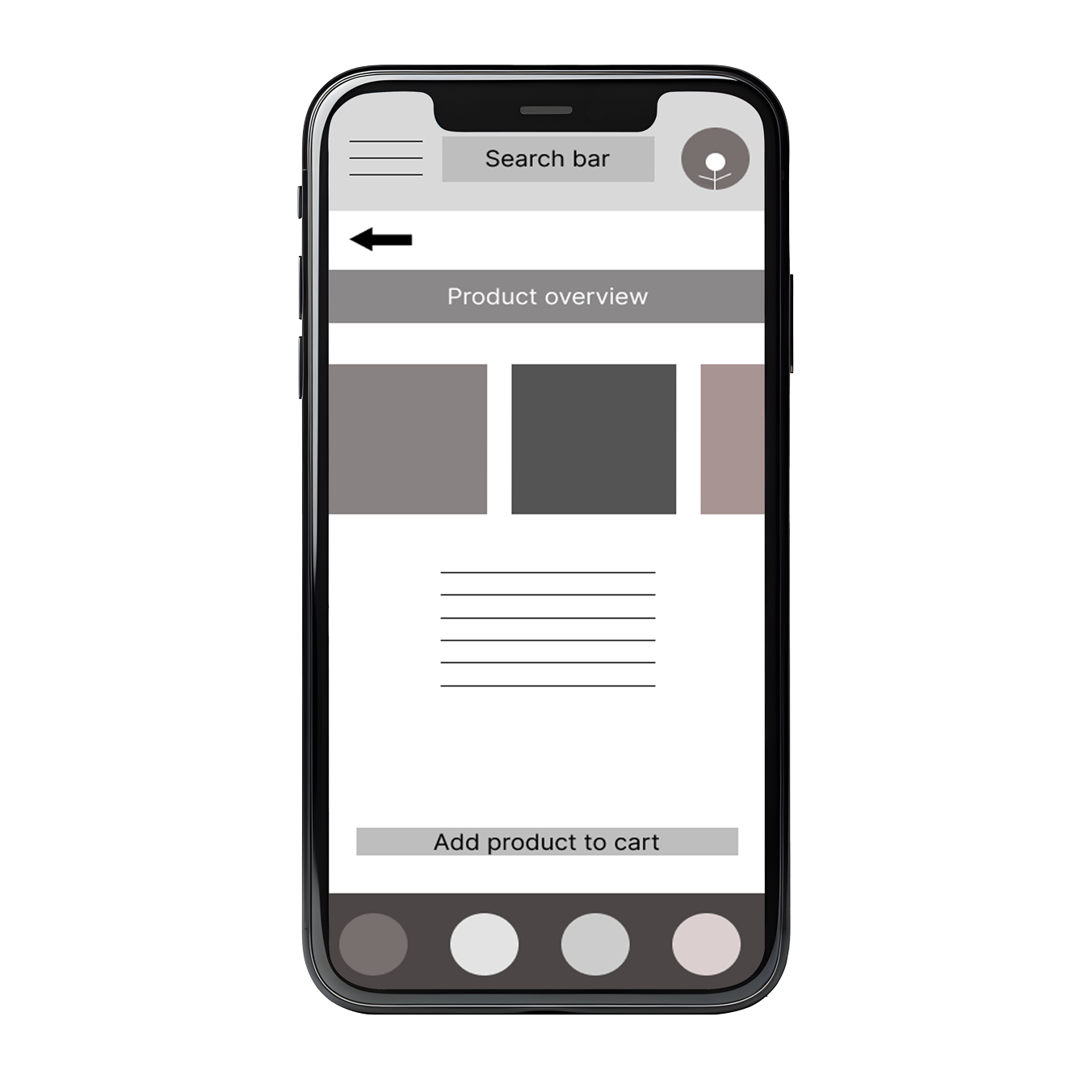
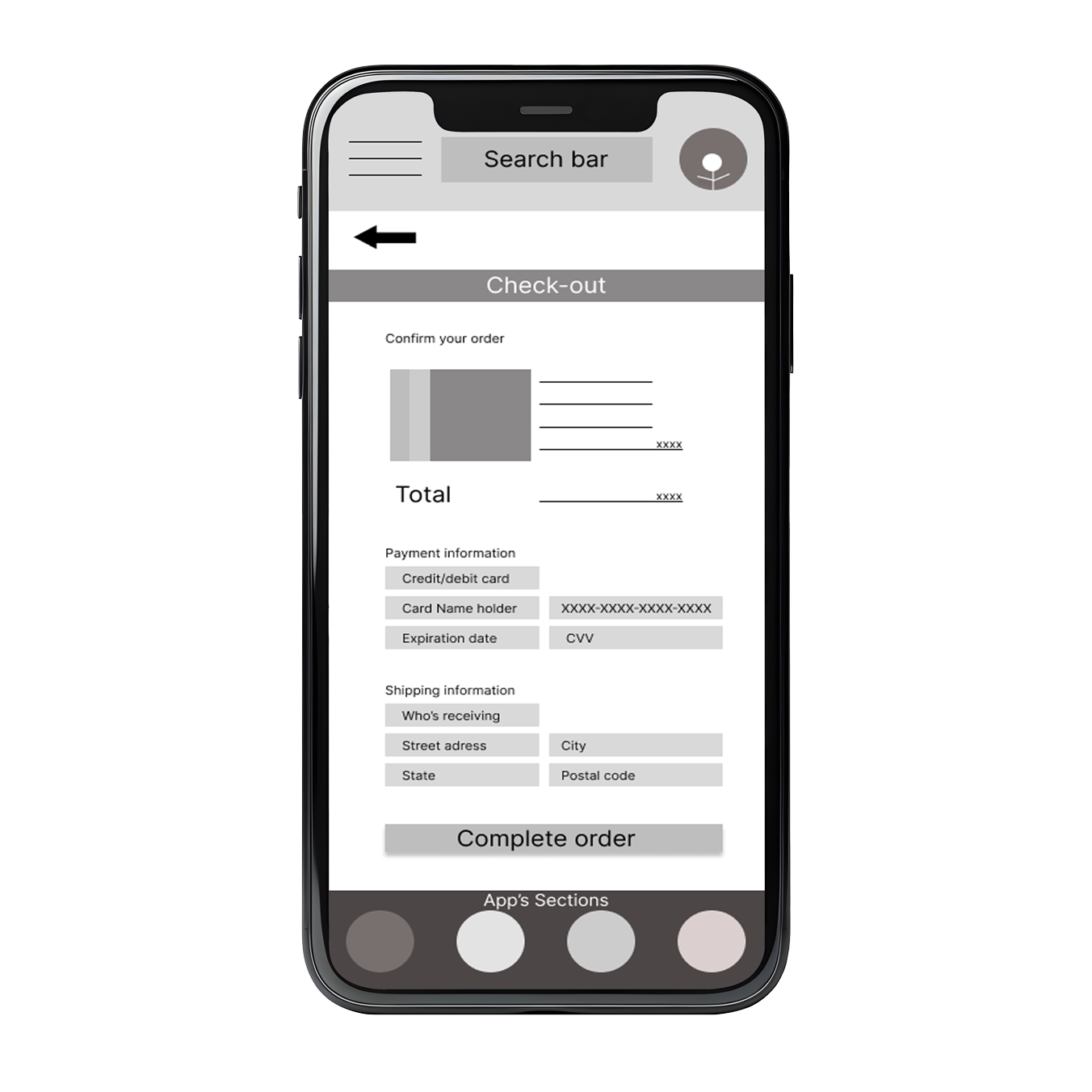
May 6, 2024
May 22, 2024

Hi-fi Prototype

We Set icons, color, images, and interactivity to the hi-fi prototype

May 22, 2024
June 15, 2024

Second usability study and iteration

We conducted usability tests and planned Iteration process
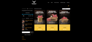
June 15, 2024
July 10, 2024

Final version

We’ve developed the last details to show the whole product

July 10, 2024

Project goal

The project goal was to create an app with a special feature where users could compare pc components’ performance and prices, the platform was also meant to build brand awareness and work well for online selling.

Project goal

The project goal was to create an app with a special feature where users could compare PC components’ performance and prices, the platform was also meant to build brand awareness and work well for online selling.

Target audience

Our target audience was adults of a wide range age from 18 -45 who were active videogame players or who needed a workstation. Males and females, all self-perceptions, all nationalities, religious beliefs and socio-economic position

Role

I worked on this project as a UX designer and researcher, responsible for creating wireframes, low and high-fi prototypes, making usability studies, and research. I worked with a team of developers, Project managers, and other roles.

Research

We completed a Secondary type research to analyze our competitors and primary one by conducting some interviews and a usability study.
we found out that many users were constantly struggling to find and compare PC components to make an upgrade in their gaming setup.

As a product of our research state, we decided to create a special feature inside an app where the user could find and pick a component, compare it with others, and could also buy it in a single place.
We also determined User Stories, personas, user flows, goal statements, and competitive audits.

Wireframes and Lo-fi prototype

We first drew the basic structure of the app, iterating between screens and elements, once we had our wireframes, we began the first visual arrangement in figma where we placed the initial items and features. We worked in:

Wireframing our first layouts
Placeholders
User flows
We prototyped the first stages of the flow

Wireframes and Lo-fi prototype

We first drew the basic structure of the app, iterating between screens and elements, once we had our wireframes, we began the first visual arrangement in figma where we placed the initial items and features. We worked in:

Wireframing our first layouts
Placeholders
User flows
We prototyped the first stages

First Usability study and Iteration

In the first usability study, we conducted prototype testing sessions, during these: We found out that most users wanted the navigation on the homepage to be larger, Most users wanted a more clear and practical way to compare components, Most users wanted a separate screen before the product overview. Therefore the iteration was primarily focused on:

Creating a separate area where the PC components can be compared, clearly. A more specific and easy way.
Designing a “Store” section which was a step before the Product overview
Creating a long home page with more content and products to show.
Creating a separate area where the PC components can be compared, clearly. A more specific and easy way.
Designing a “Store” section which was a step before the Product overview
Creating a long home page with more content and products to show.

Second version

During this phase, we added color, typography, iconography, images, texts, and some extra prototyping, increasing the user flows, variables and components used across the project. In the second version we were focused on:

Adding a more clear and friendly way to compare components while allowing the user to add a component to the cart from the comparator page (Slide 2)
The design and iteration of the “Store” page (slide 5)
Adding content on the homepage and improving the product overview
Prototyping even further allowing users to add or subtract items on the cart page

Second Usability study and Iteration

We conducted a second study, testing the improved prototype, we asked the participants to add products to the cart page, to test the comparator tool, to navigate through the app and to complete certain tasks. During these sessions, we found that most users had to leave the section to go straight to store so they could finally add the product to the cart therefore: we needed to add or specify what products will be compared, we had to add a little product list on the comparator tool and a way to add the product to the cart without leaving this section. During this phase we also determined certain accessibility features like:

Light and dark mode to help visually the users when navigating during night hours
List of products and “Add to cart buttons” inside the comparator tool (slides 1 and 2 )
Annotations to the developer’s team focused on the browser screen readers (slide 3)

Final version

Once we finished the iterations programmed after the second usability study, we improved some details like typography, animations, buttons, and the navigation menu. During this project I improved my skills, my Figma design and prototyping, I learned how to collaborate seamlessly with other teams and to iterate for the best performance of a digital product

List item
List item
List item

Other Collabs

Web Site Projects

Graphic and visual elements for web

Graphic and visual elements for web store

×


Hola!

Elige alguno de nuestros representantes para hablar directamente

× Escríbenos a whatsapp.